# Plot the entire streamflow time seriesThe Midwest underwater
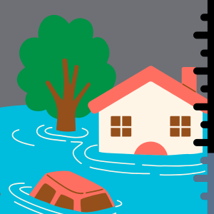
A look at 2019 floods in South Dakota, USA
In March 2019, large parts of South Dakota were flooded for weeks. What happened to cause this flooding? What were the impacts on local communities? We will use environmental data to determine where and when flooding happened and how long it lasted. Then, we’ll use that same data to put the floods in context historically and discuss how to plan for future disasters.

Read More
Check out what some US government and news sources said about the floods in 2019. Here are some resources from different sources to get you started:
If you know someone who lived through these or similar floods, we also invite you to ask them about that experience.
Reflect and Respond
Based on your reading and conversations, what do you think some of the causes of the 2019 flooding in South Dakota were?
STEP 1: Site Description and Map
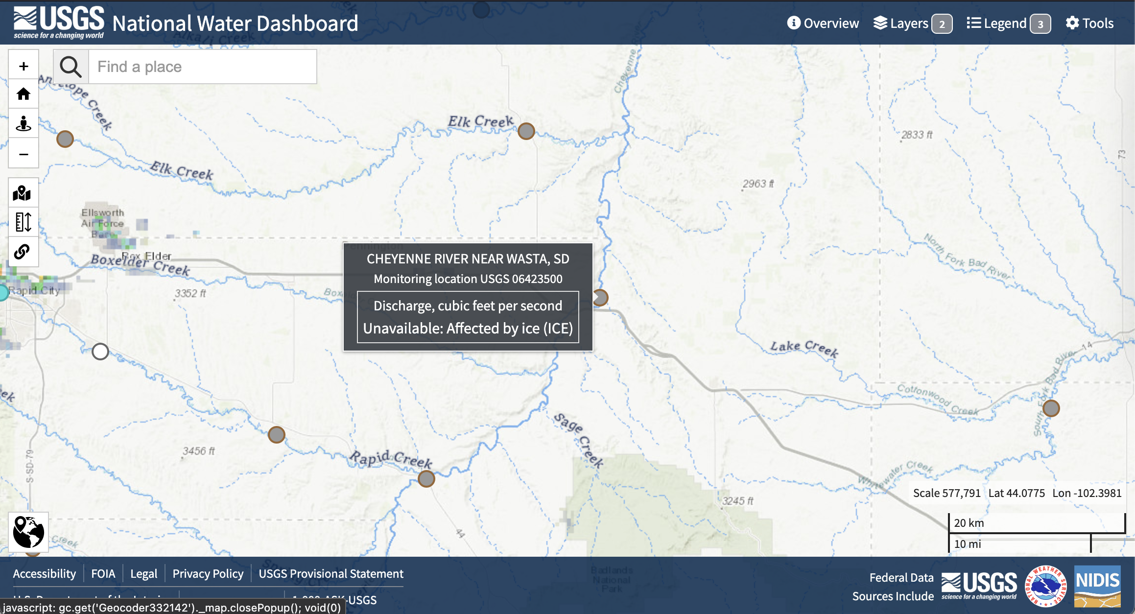
In our example analysis, we’ll be focusing on the Cheyenne River, which flows into Lake Oahu by looking at a stream gage near Wasta, SD, USA. After we’ve completed this example analysis, we suggest that you look into another flood – perhaps one that you have a personal connection to.
Site Description
Try It
Describe the Cheyenne River area in a few sentences. You can include:
- Information about the climatology of the area, or typical precipitation and temperature at different months of the year
- The runoff ratio (average annual runoff divided by average annual precipitation)
- Which wildlife and ecosystems exist in the area
- What communities and infrastructure are in the area
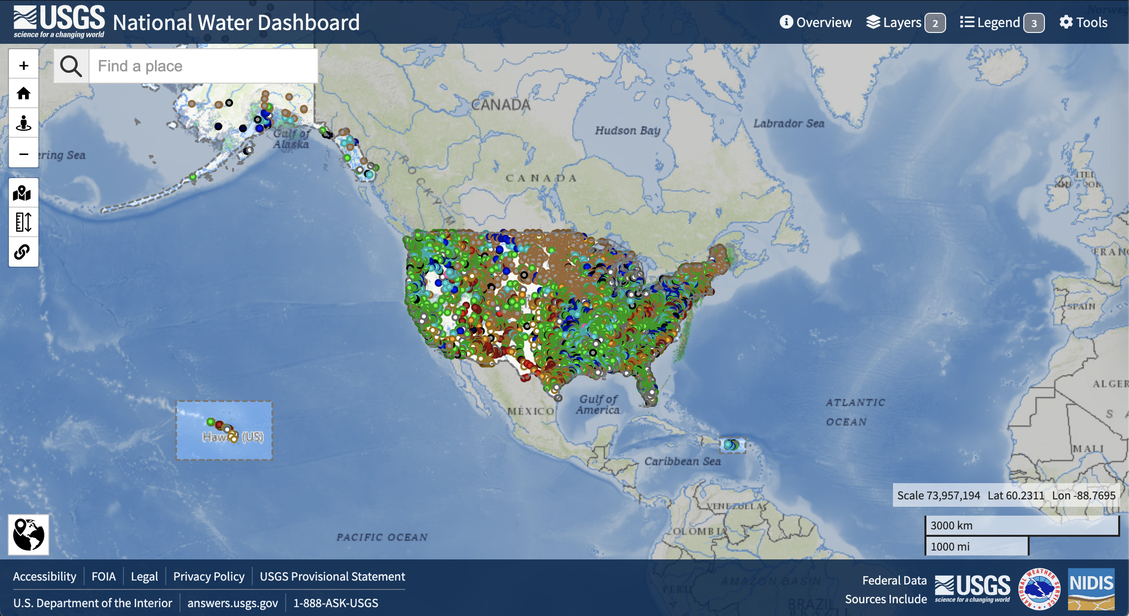
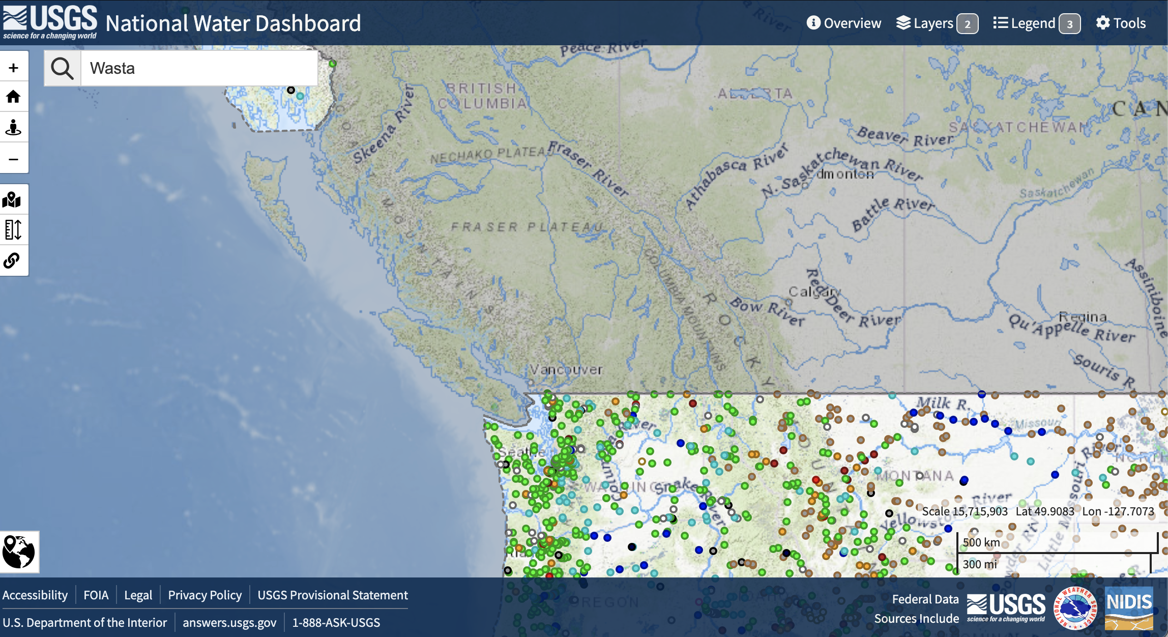
Interactive Site Map
Get set up to use Python
Use the cell below to add necessary package imports to this notebook. It’s best to import everything in your very first code cell because it helps folks who are reading your code to figure out where everything comes from (mostly right now this is you in the future). It’s very frustrating to try to figure out what packages need to be installed to get some code to run.
Note
Our friend the PEP-8 style guide has some things to say about imports. In particular, your imports should be in alphabetical order.
Try It
- Add the library for working with vector data in Python and a library for creating interactive plots of vector and time-series data to the imports.
- Check that your imports follow the PEP-8 guidelines – they should be in alphabetical order.
- Run your import cell to make sure everything will work
import dataretrieval # Get data from the USGSSee our solution!
import dataretrieval # Get data from the USGS
import geopandas as gpd # Vector data
import hvplot.pandas # Interactive plots
Site Map: The Cheyenne River near Wasta
The code below will create an interactive map of the area. But something is wrong - no one defined the latitude and longitude as variables. Try running the code to see what happens when you reference a variable name that doesn’t exist!
Try It
Find the location of the Cheyenne River near Wasta USGS stream gauge using the National Water Information System. This is not the easiest thing to find if you aren’t used to NWIS, so we’ve provided some screenshots of the process below.
Step 1: NWIS Mapper
Step 2: Search
Wasta in the Find a Place boxStep 3: Select gage
Step 4: Open site page
Site page at the top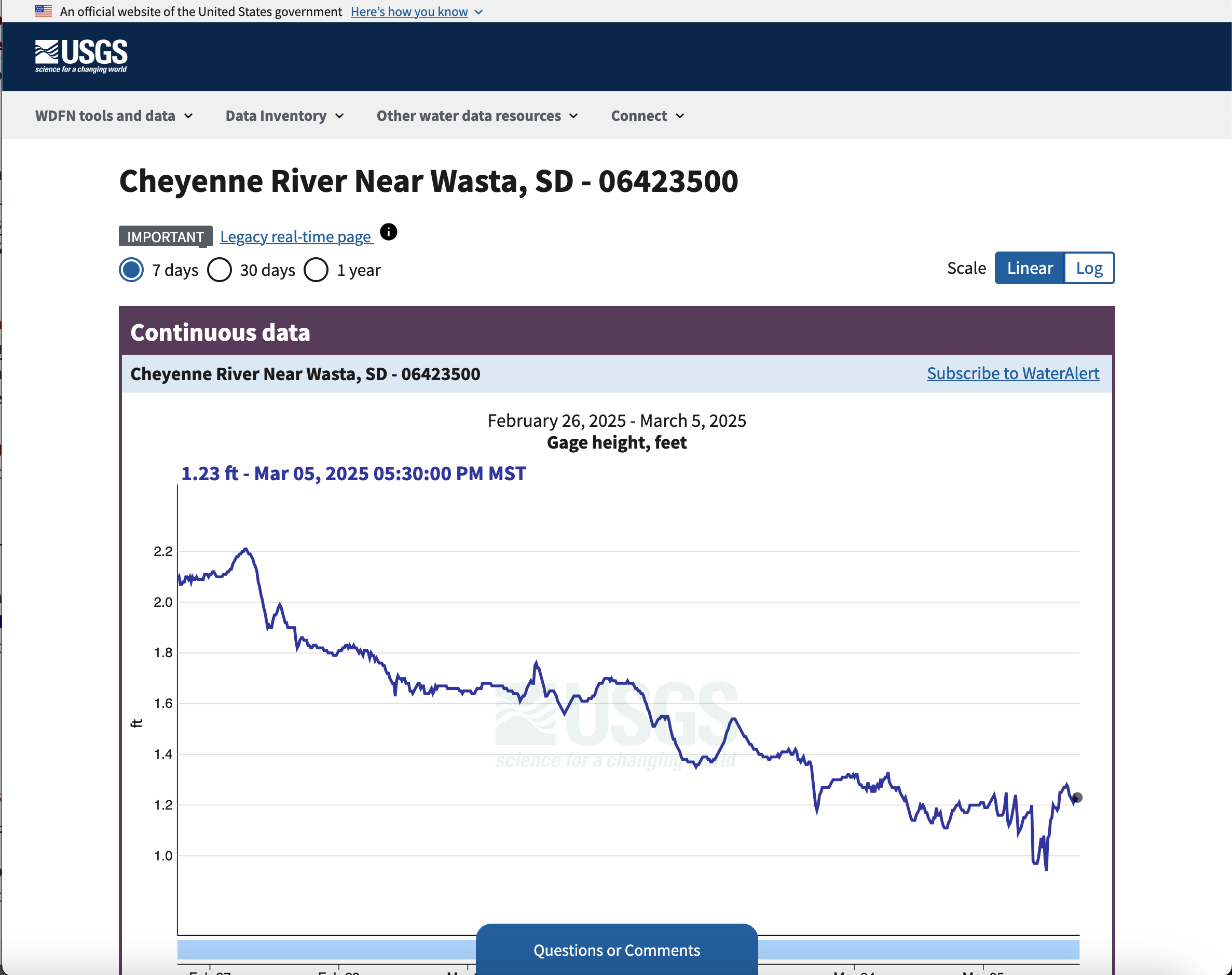
Step 5: Get coordinates
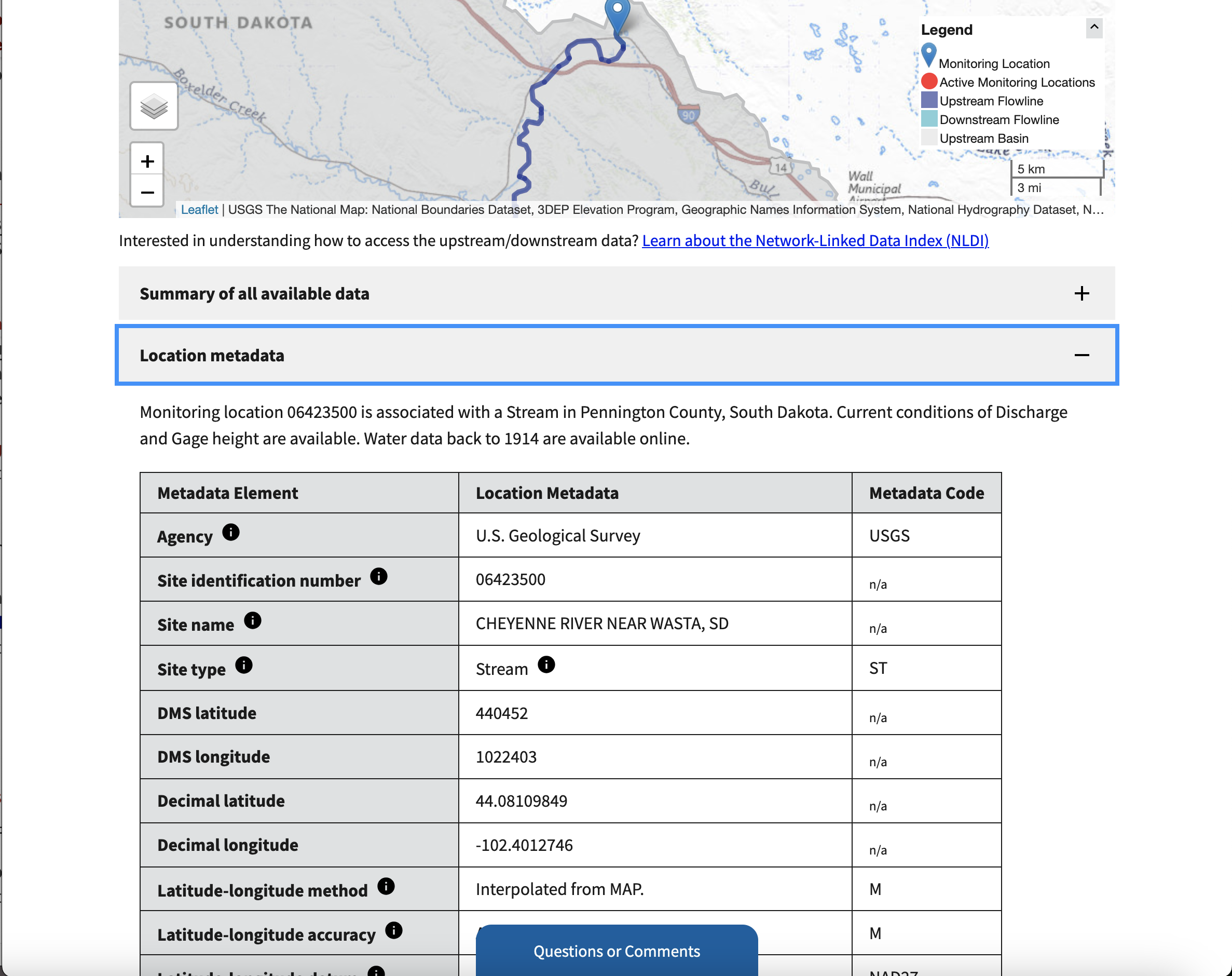
Location metadata section. Make a note of the decimal latitude and longitude!
Try It
Now, you’re ready to create your site map!
- Define latitude and longitude variables to match the variable names used in the code.
- Rename the variable
gdfwith something descriptive wherever it occurs. - Run and test your cell to make sure everything works.
Looking for an Extra Challenge?
Customize your plot using the hvplot documentation or by asking your favorite AI tool. For example, you could:
- Change the size of your map
- Change the base map images
- Change the color and size of your place marker
- Remove the axis labels for a cleaner map
# Create a GeoDataFrame with the gage location
gdf = gpd.GeoDataFrame(
    # Create the geometry from lat/lon
    geometry=gpd.points_from_xy([gage_lon], [gage_lat]),
    # Coordinate Reference System for lat/lon values
    crs="EPSG:4326"
)

# Plot using hvPlot with a basemap
buffer = 0.01
gdf.hvplot.points(
    # Use web tile basemap imagery
    geo=True, tiles='OpenTopoMap',
    # Set approximate bounding box
    ylim=(gage_lat-buffer, gage_lat+buffer),
    xlim=(gage_lon-buffer, gage_lon+buffer),
)
See our solution!
gage_lat = 44.08109849
gage_lon = -102.4012746

# Create a GeoDataFrame with the gage location
gage_gdf = gpd.GeoDataFrame(
    # Create the geometry from lat/lon
    geometry=gpd.points_from_xy([gage_lon], [gage_lat]),
    # Coordinate Reference System for lat/lon values
    crs="EPSG:4326"
)

# Plot using hvPlot with a basemap
buffer = 0.01
gage_gdf.hvplot.points(
    # Use web tile basemap imagery
    geo=True, tiles='EsriImagery',
    # Display the gage name
    hover_cols=['name'],
    # Format streamgage marker
    color='red', size=100,
    # Set figure size
    width=500, height=300,
    # Set approximate bounding box
    ylim=(gage_lat-buffer, gage_lat+buffer),
    xlim=(gage_lon-buffer, gage_lon+buffer),
    # Remove axis labels
    xaxis=None, yaxis=None
)
STEP 2: Access streamflow data
One way to express how big a flood is by estimating how often larger floods occur. For example, you might have heard news media talking about a “100-year flood”.
In this notebook, you will write Python code to download and work with a time series of streamflow data during the flooding on the Cheyenne River.
Tip
A time series of data is taken at the same location but collected regularly or semi-regularly over time.
You will then use the data to assess when the flooding was at it’s worst.
As an extra challenge you could consider how the values compared to other years by computing the flood’s return period.
Tip
A return period is an estimate of how often you might expect to see a flood of at least a particular size. This does NOT mean an extreme flood “has” to occur within the return period, or that it couldn’t occur more than once. However, it does allow us to assess the probability that a sequence of floods would happen and evaluate whether or not we need to change forecasting tools or engineering standards to meet a new reality. For example, it would be really unusual to get three 100-year floods in a ten year period without some kind of underlying change in the climate.
Read More
Here are some resources from your text book you can review to learn more:
Reflect and Respond
Explain what data you will need to complete this analysis, including:
- What type or types of data do you need?
- How many years of data do you think you need to compute the return period of an extreme event like the 2019 Cheyenne River floods?
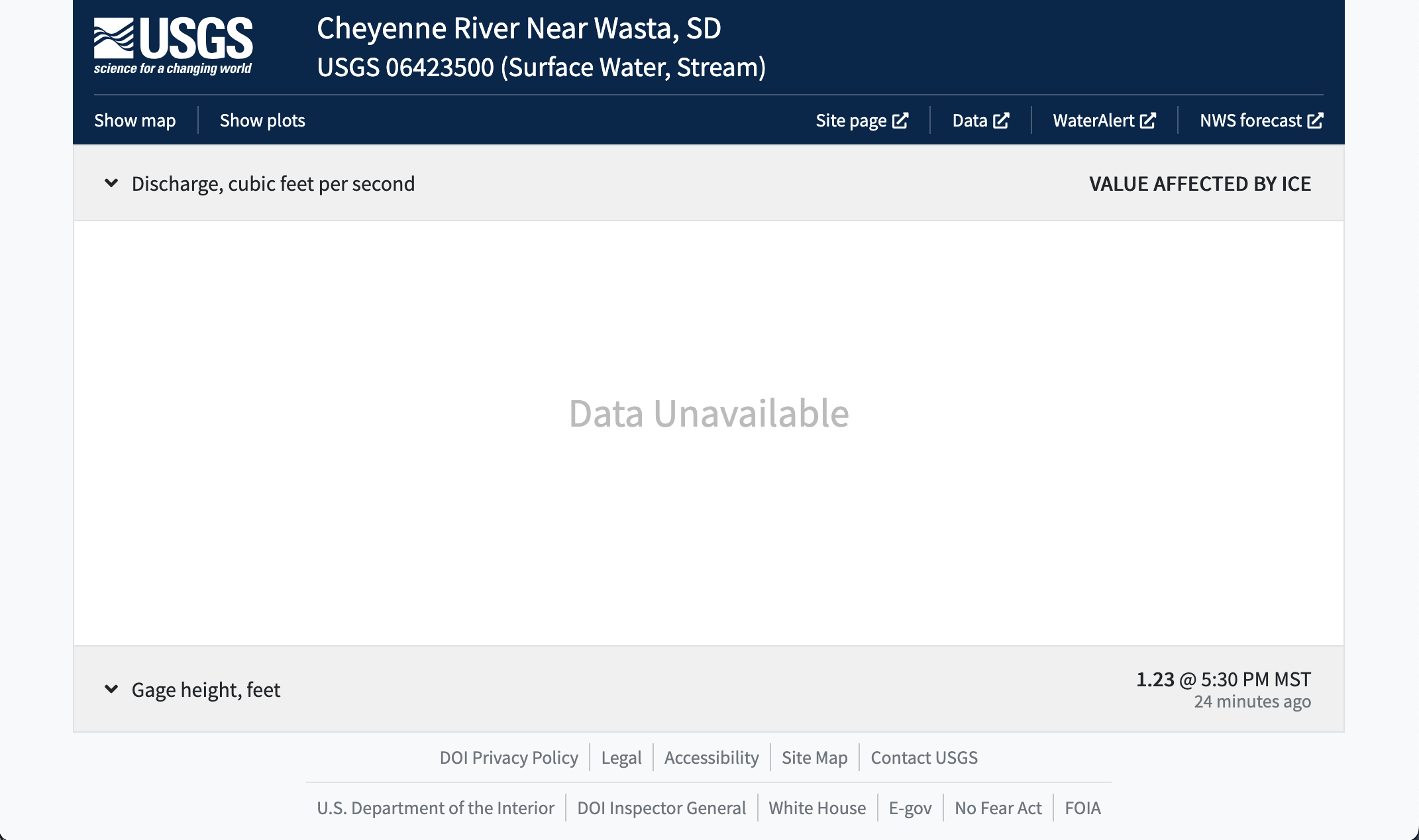
The National Water Information Service
US streamflow data are freely available online from the National Water Information Service (NWIS). These data are collected by the US Geological Survey by comparing the height, or stage of a river or stream with a series of flow measurements.
Using the NWIS data website
Read More
Read more about how the USGS collects streamflow data at the USGS Water Science School site
You’ll start out by previewing the data online so that you can get a feel for what it looks like. Then, you’ll access the data using the dataretrieval Python package maintained by the USGS.
Try It
To preview the data, follow along with the screenshots below to complete these steps:
- Return to the Cheyenne River near Wasta site page.
- Change the dates on the data.
- Try downloading some data with your web browser to see what it looks like
Step 1: Open up the site page
Step 2: Data type
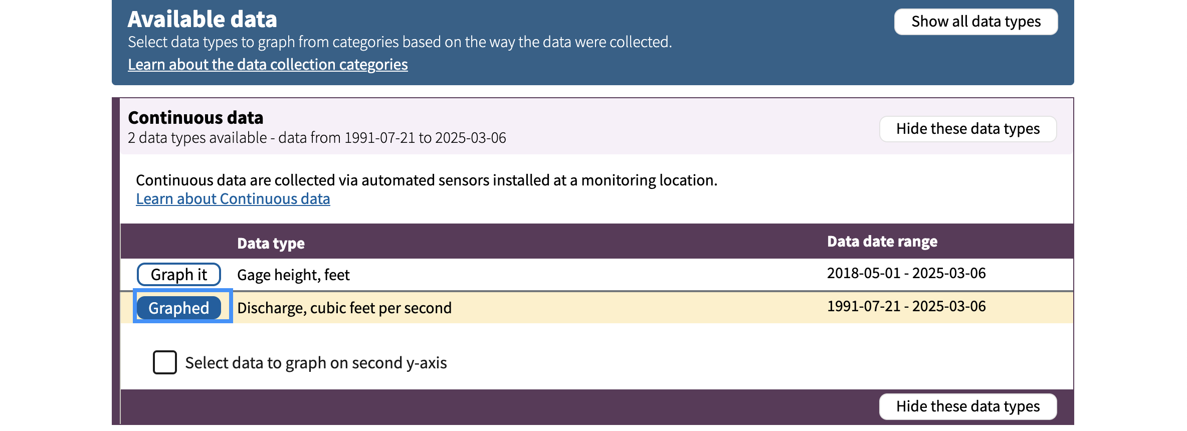
Step 2: Change the plot dates
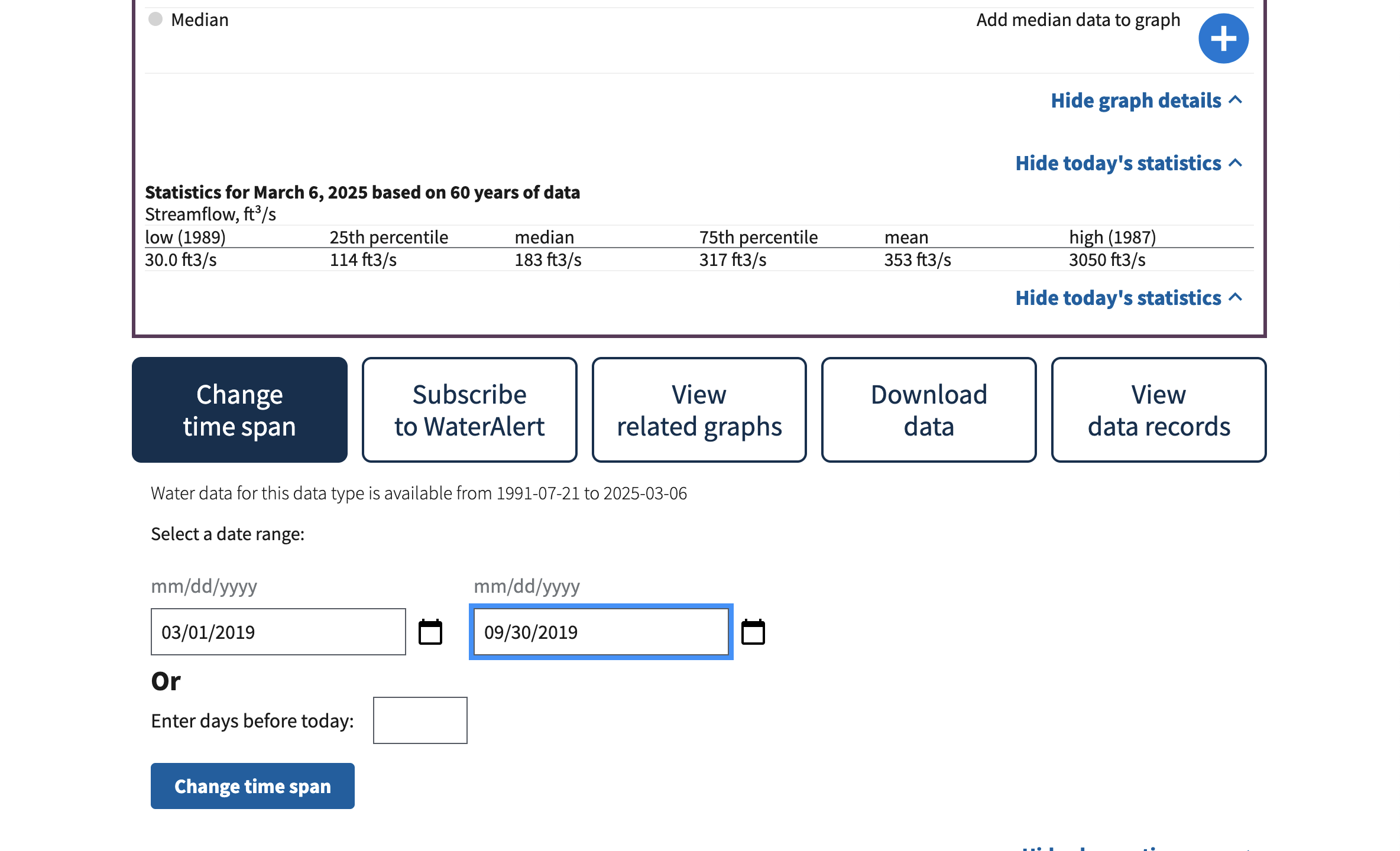
Step 3: Look at the data
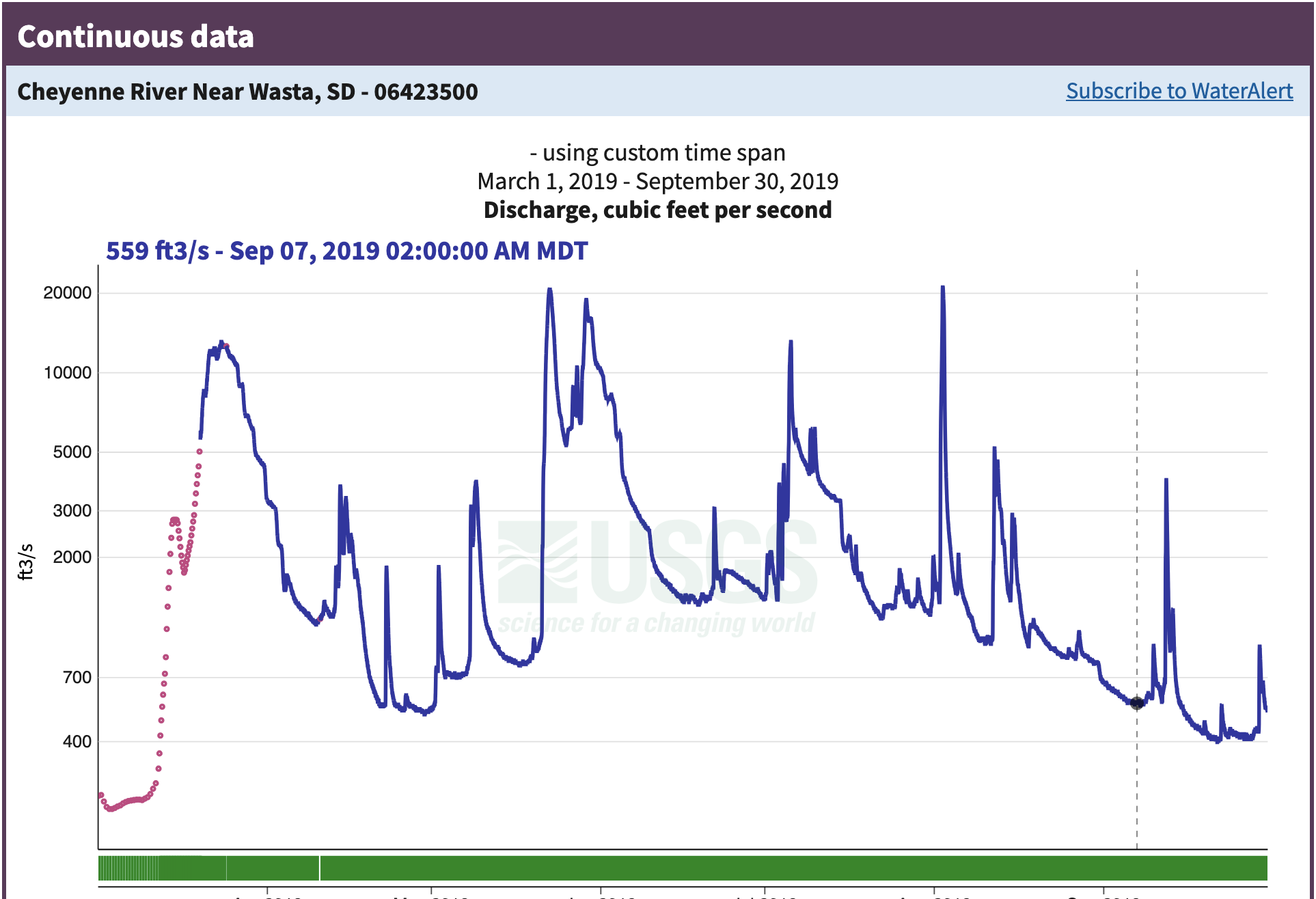
Reflect and Respond
What do you notice about this data? You can think about:
- What type of data is it?
- What dates in 2019 had the worst flooding?
- How unusual were the 2019 floods?
- Does anything about the data seem unusual to you?
Step 4: Look at some raw data
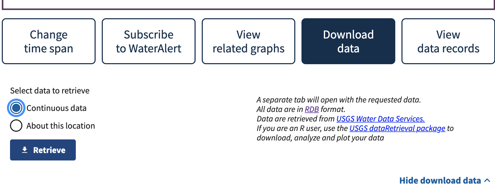 Open up the file you downloaded – it should automatically open in your web browser. Does this look like streamflow data to you?
Read More
Check out the NWIS documentation to find out more about how these data are formatted.
Reflect and Respond
What do you notice about the data? Write down your thoughts on:
- What separator or delimiter does the data use to separate columns?
- What should the data types of each column be?
- Which column contains the streamflow data?
- Do you need to skip any rows that don’t contain data? How can you identify those rows?
- Did you notice anything else?
Data description and citation
Reflect and Respond
Describe your data. Include the following information:
- A 1-2 sentence description of the data
- Data citation
- What are the units?
- What is the time interval for each data point?
- Is there a “no data” value, or a value used to indicate when the sensor was broken or didn’t detect anything? (These are also known as NA, N/A, NaN, nan, or nodata values)
Access the data
One way to access data is through an Application Programming Interface, or API. Luckily for us, the USGS has written a Python library to interface with the NWIS API, called dataretrieval. The dataretrieval.nwis submodule has a function or command for downloading stream discharge data from the NWIS!
Try It
The code below needs some changes from you before it will run.
- Find the site number on the site page for the Cheyenne River near Wasta gage.
- Determine what date range you would like to download. For right now, start by downloading just the data
- Define variables for the site number, start date, and end date to match the rest of the code. You can find the site number on the site page.
- Download the data using the provided code.
Note that the dataretrieval.nwis.get_discharge_measurements() function returns data in a format called a pandas DataFrame, as well as metadata in a format called a NWIS_metadata. That’s why we need two variables to store the results.
Water Years
When we look at streamflow data, we usually try to download water years rather than calendar years. The water year in the Northern Hemisphere starts on October 1 of the previous calendar year and runs through September 31. For example, water year 2018 (or WY2018) runs from October 1, 2017 to September 31, 2018.
Why is the water year different? In most of the Northern Hemisphere, the snowpack is as low as it gets around October 1, and begins to build up for the winter at that point. When we’re keeping track of water fluxes, it’s easiest if we don’t need a count on how much water is in the snow pack at the start of the year.
Reflect and Respond
What parameter would you change in the code below if you wanted to switch locations?
# Define download parameters

# Get discharge data and metadata from NWIS
nwis_df, meta = dataretrieval.nwis.get_discharge_measurements(
    sites=site_number,
    start=start_date,
    end=end_date)
nwis_df
See our solution!
# Define download parameters
site_number = '06423500'
start_date = '1934-10-01'
end_date = '2024-09-30'

# Get discharge data and metadata from NWIS
nwis_df, meta = dataretrieval.nwis.get_dv(
    sites=site_number,
    start=start_date,
    end=end_date
    )

# Display downloaded data
nwis_df| site_no | 00060_Mean | 00060_Mean_cd | 00065_Mean | 00065_Mean_cd | |
|---|---|---|---|---|---|
| datetime | |||||
| 1934-10-01 00:00:00+00:00 | 06423500 | 54.0 | A | NaN | NaN |
| 1934-10-02 00:00:00+00:00 | 06423500 | 51.0 | A | NaN | NaN |
| 1934-10-03 00:00:00+00:00 | 06423500 | 51.0 | A | NaN | NaN |
| 1934-10-04 00:00:00+00:00 | 06423500 | 54.0 | A | NaN | NaN |
| 1934-10-05 00:00:00+00:00 | 06423500 | 54.0 | A | NaN | NaN |
| ... | ... | ... | ... | ... | ... |
| 2024-09-26 00:00:00+00:00 | 06423500 | 103.0 | A | 0.44 | A |
| 2024-09-27 00:00:00+00:00 | 06423500 | 94.9 | A | 0.40 | A |
| 2024-09-28 00:00:00+00:00 | 06423500 | 90.7 | A | 0.39 | A |
| 2024-09-29 00:00:00+00:00 | 06423500 | 83.9 | A | 0.36 | A |
| 2024-09-30 00:00:00+00:00 | 06423500 | 73.6 | A, e | NaN | NaN |
32866 rows × 5 columns
Let’s check your data. A useful method for looking at the datatypes in your pd.DataFrame is the pd.DataFrame.info() method.
Tip
In Python, you will see both methods and functions when you want to give the computer some instructions. This is an important and tricky distinction. For right now – functions have all of their arguments/parameters inside the parentheses, as in dataretrieval.nwis.get_discharge_measurements(). For methods, the first argument is always some kind of Python object that is placed before the method. For example, take a look at the next cell for an example of using the pd.DataFrame.info() method.
Try It
Replace dataframe with the name of your DataFrame variable
dataframe.info()See our solution!
nwis_df.info()<class 'pandas.core.frame.DataFrame'>
DatetimeIndex: 32866 entries, 1934-10-01 00:00:00+00:00 to 2024-09-30 00:00:00+00:00
Data columns (total 5 columns):
# Column Non-Null Count Dtype
--- ------ -------------- -----
0 site_no 32866 non-null object
1 00060_Mean 32866 non-null float64
2 00060_Mean_cd 32866 non-null object
3 00065_Mean 1592 non-null float64
4 00065_Mean_cd 1592 non-null object
dtypes: float64(2), object(3)
memory usage: 1.5+ MB
Reflect and Respond
What column do you think the streamflow, or discharge, measurements are in?
Data cleaning
The dataretrieval library has taken care of a lot of the work of accessing and importing NWIS data. However, we still want to clean up the data a little, by selecting the column we want and renaming it with a descriptive label.
Organize your data descriptively
It’s important to make sure that your code is easy to read. Even if you don’t plan to share it, you will likely need to read code you’ve written in the future!
Try It
Using the code below as a starting point, select the discharge column and rename it to something descriptive:
- Identify the discharge column.
- Replace
discharge_column_namewith the discharge column name. - Replace
new_column_namewith a descriptive name. We recommend including the units of the discharge values in the column name as a way to keep track of them.
discharge_df = (
    nwis_df
    # Select only the discharge column as a DataFrame
    [['discharge_column_name']]
    # Rename the discharge column
    .rename(columns={'discharge_column_name': 'new_column_name'})
)

discharge_df
See our solution!
discharge_df = (
    nwis_df
    # Select only the discharge column as a DataFrame
    [['00060_Mean']]
    # Rename the discharge column
    .rename(columns={'00060_Mean': 'streamflow_cfs'})
)

discharge_df| streamflow_cfs | |
|---|---|
| datetime | |
| 1934-10-01 00:00:00+00:00 | 54.0 |
| 1934-10-02 00:00:00+00:00 | 51.0 |
| 1934-10-03 00:00:00+00:00 | 51.0 |
| 1934-10-04 00:00:00+00:00 | 54.0 |
| 1934-10-05 00:00:00+00:00 | 54.0 |
| ... | ... |
| 2024-09-26 00:00:00+00:00 | 103.0 |
| 2024-09-27 00:00:00+00:00 | 94.9 |
| 2024-09-28 00:00:00+00:00 | 90.7 |
| 2024-09-29 00:00:00+00:00 | 83.9 |
| 2024-09-30 00:00:00+00:00 | 73.6 |
32866 rows × 1 columns
Strings
How does a computer tell the difference between a name which is linked to a value, and a string of characters to be interpreted as text (like a column name)?
In most programming languages, we have to put quotes around strings of characters that are meant to be interpreted literally as text rather than symbolically as a variable. In Python, you can use either single ' or double " quotes around strings. If you forget to put quotes around your strings, Python will try to interpret them as variable names instead, and will probably give you a NameError when it can’t find the linked value.
STEP 3: Visualize the flood
Visualizing the data will help make sure that everything is formatted correctly and makes sense. It also helps later on with communicating your results.
Can we see the flood in the streamflow data?
Let’s take a look at the data from February - September, 2019. This should let us see the peak streamflow values and when they occurred.
Try It
Below, you will see an example of how to subset your streamflow data by date.We do this using the .loc attribute of your DataFrame, which is a powerful tool for selecting the rows you want. Because the dates are in the Python datetime64 format, you can select based on the year and month, without needing to type out dates or times!
- Replace
dataframe_namewith your streamflowDataFramename. - Save the result to a descriptive variable name, and call it at the end of the cell for testing.
You can find some examples of subsetting time series data in the textbook.
dataframe_name.loc['2019-02':'2019-09']See our solution!
flood_df = discharge_df.loc['2019-02':'2019-09']
flood_df| streamflow_cfs | |
|---|---|
| datetime | |
| 2019-02-01 00:00:00+00:00 | 147.0 |
| 2019-02-02 00:00:00+00:00 | 192.0 |
| 2019-02-03 00:00:00+00:00 | 233.0 |
| 2019-02-04 00:00:00+00:00 | 244.0 |
| 2019-02-05 00:00:00+00:00 | 234.0 |
| ... | ... |
| 2019-09-26 00:00:00+00:00 | 419.0 |
| 2019-09-27 00:00:00+00:00 | 416.0 |
| 2019-09-28 00:00:00+00:00 | 430.0 |
| 2019-09-29 00:00:00+00:00 | 631.0 |
| 2019-09-30 00:00:00+00:00 | 572.0 |
242 rows × 1 columns
Create a line plot with Python
Next, plot your subsetted data. Don’t forget to label your plot!
Try It
(
    dataframe_name
    .plot(
        xlabel='',
        ylabel='',
        title='')
)
See our solution!
(
    flood_df
    .plot(
        xlabel='Date',
        ylabel='Streamflow (cfs)',
        title='Streamflow on the Cheyenne River during a flood',
        legend=False)
)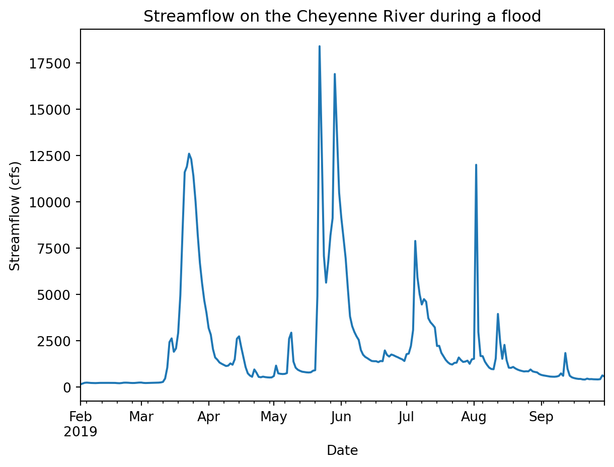
You should be able to see the flood in your data going up above 12000 cfs at its peak. But how unusual is that really?
STEP 4: Analyse the flood
As scientists and engineers, we are interested in not just describing a flood, but in understanding how often we would expect an event that severe or extreme to happen. Some applications we need this information for include:
- Designing and developing engineering standards for bridges and roads to withstand flooding
- Choosing the capacity of water treatment plants to accommodate flood waters
- Computing flood risk maps and choosing where to build
- Determining flood insurance rates
The exceedance probability is a simple, data-driven way to quantify how unusual a flood is and how often we can expect similar events to happen. We calculate exceedance probability by counting how many years with floods the same size or larger have been recorded, or ranking the and dividing by the number of years we have records for:
\[P_e = \frac{\text{Annual peak flow rank}}{\text{Years of record}}\]
This value tells us historically what the likelihood was of a flood of a certain size or larger each year, or the exceedance probability. We can also express how unusual a flood is with the return period, or an amount of time during which we’d expect there to be about one flood the same size or larger. The return period is the reciprocal of the exceedance probability:
\[R = \frac{\text{Years of record}}{\text{Annual peak flow rank}}\]
As an example – suppose a streamflow of \(10000\) cfs occurs \(4\) times over a 100-year record. The exceedance probability would be \(\frac{4}{100} = .25\) and the return period would be 25 years.
There are advantages and disadvantages to this method of calculating the exceedance probability. On one hand, we are not making any assumptions about how often floods occur, and there is no way to extrapolate to a size of flood that has never been observed. On the other hand, we can’t incorporate any information about how often floods occur nearby or in other locations, and the data record for streamflow is often less than the desired lifetime of the built environment.
Read More
You can learn more about exceedance probabilities and return periods in this textbook page on the subject
Let’s start by accessing and plotting ALL the data available for this site. Then we’ll use a return period statistic to quantify how unusual it was.
Visualize all the streamflow data
Try It
In the cell below, plot the entire time series of streamflow data, without any parameters.
See our solution!
# Plot the entire streamflow time series
(
    discharge_df
    .plot(
        xlabel='Date',
        ylabel='Streamflow (cfs)',
        title='90 Years of Streamflow on the Cheyenne River',
        legend=False)
)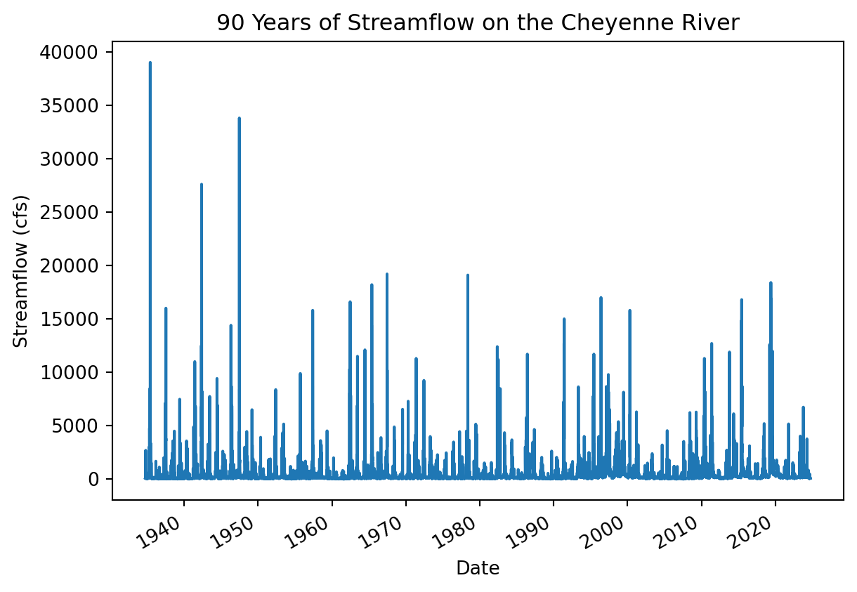
Reflect and Respond
Do you notice anything about this plot?
First things first – this plot looks a little fuzzy because it is trying to fit too many data points in a small area. There aren’t enough pixels in this plot to represent all the data points! One way to improve this is by resampling the data to annual maxima. That way we still get the same peak streamflows, but the computer will be able to plot all the values without overlapping.
Tip
Resampling means changing the time interval between time series observations - in this case from daily to annual.
Read More
Read about different ways to resample time series data in your textbook
You can use a list of offset aliases to look up how to specify the final dates. This list is pretty hard to find - you might want to bookmark it or check back with this page if you need it again.
Try It
Resample your DataFrame to get an annual maximum:
- Replace
dataframe_namewith the name of yourDataFrame. - Replace
offset_aliaswith the correct offset alias from the pandas documentation - Save the results to a new, descriptive variable name, and display the results of the resampling.
# Resample to annual maxima
dataframe_name.resample(offset_alias).max()
See our solution!
# Resample to annual maxima
peaks_df = discharge_df.resample('YS').max()
peaks_df| streamflow_cfs | |
|---|---|
| datetime | |
| 1934-01-01 00:00:00+00:00 | 2700.0 |
| 1935-01-01 00:00:00+00:00 | 39000.0 |
| 1936-01-01 00:00:00+00:00 | 1680.0 |
| 1937-01-01 00:00:00+00:00 | 16000.0 |
| 1938-01-01 00:00:00+00:00 | 4500.0 |
| ... | ... |
| 2020-01-01 00:00:00+00:00 | 1800.0 |
| 2021-01-01 00:00:00+00:00 | 5170.0 |
| 2022-01-01 00:00:00+00:00 | 1540.0 |
| 2023-01-01 00:00:00+00:00 | 6740.0 |
| 2024-01-01 00:00:00+00:00 | 3770.0 |
91 rows × 1 columns
Try It
Plot your resampled data.
# Plot annual maximum streamflow valuesSee our solution!
# Plot annual maximum streamflow values
peaks_df.plot(
    figsize=(8, 4),
    xlabel='Year',
    ylabel='Daily Streamflow (cfs)',
    title='Annual Maximum Daily Streamflow Values on the Cheyenne River',
    legend=False)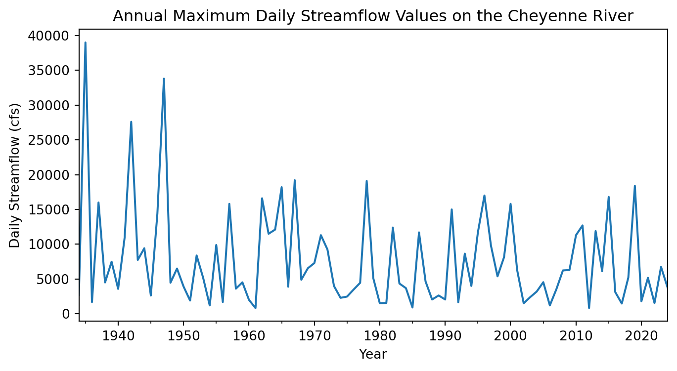
Reflect and Respond
Write a headline and 2-3 sentence description of your plot. What is your visual estimate of the return period was for the flood in 2019?
Select relevant data
When calculating exceedance probabilities, we are making an assumption of stationarity, meaning that all the peak streamflows are drawn from the same probability distribution. Put another way, we only want to include data from years where the conditions on the river are similar to what they are now.
Did you notice that the streamflow values from before 1950 or so? You should investigate any obvious causes of that discrepancy so we know if the pre-1950 data is relevant to current conditions.
Reflect and Respond
What are some possible causes for peak streamflows to decrease systematically?
One of the problems with adapting to climate change is that we can no longer assume stationarity in a lot of contexts. As scientists, we don’t yet have standard methods for incorporating climate change into flood return period calculations. You can read more about the debate of stationarity, climate change, and return periods in a paper called ‘Stationarity is Dead’ and the many related response papers.
It turns out that construction on the Oahe dam on the Cheyenne River was started in 1948. We therefor don’t want to include any streamflow measurements before that date, because the Cheyenne River now as a much different flood response due to the dam. Dams tend to reduce peak streamflow, depending on how they are managed, but can cause other problems in the process.
Read More
Learn more about the Oahe Dam on its Wikipedia page. You can also find some local perspectives on the dam in some of the articles about the 2019 flood at the beginning of this coding challenge.
Try It
Remove years of data before the construction of the Oahe Dam. You can use a colon inside the square brackets of the .loc attribute to show that you would like all dates after a certain value, e.g. '1950':
# Select data from after dam constructionSee our solution!
peaks_df = peaks_df.loc['1948':]
peaks_df| streamflow_cfs | |
|---|---|
| datetime | |
| 1948-01-01 00:00:00+00:00 | 4460.0 |
| 1949-01-01 00:00:00+00:00 | 6500.0 |
| 1950-01-01 00:00:00+00:00 | 3920.0 |
| 1951-01-01 00:00:00+00:00 | 1900.0 |
| 1952-01-01 00:00:00+00:00 | 8380.0 |
| ... | ... |
| 2020-01-01 00:00:00+00:00 | 1800.0 |
| 2021-01-01 00:00:00+00:00 | 5170.0 |
| 2022-01-01 00:00:00+00:00 | 1540.0 |
| 2023-01-01 00:00:00+00:00 | 6740.0 |
| 2024-01-01 00:00:00+00:00 | 3770.0 |
77 rows × 1 columns
Calculate the exceedance probability and return period for 2019
Looking for an Extra Challenge?
Calculate the exceedance probability and return period for each year of the annual data, and add them as columns to your DataFrame.
- Replace
dfwith the name of your annual maximumDataFrame. - Replace
colwith the name of your streamflow column - Calculate the return period using Python mathematical operators
Tip
When you use a Python mathematical operator on a pandas.DataFrame column, Python will do the calculation for every row in the DataFrame automatically!
Tip
When you rank the floods in your DataFrame with the .rank() method, you will need the ascending=Falseparameter, by default the largest floods will have the higher number. We useascending=Falsa` to reverse the rankings, since higher rank should be lower exceedence probability.
df['exceed_prob'] = (df.rank(ascending=False).col / len(df))
df['return_period'] =

peaks_df
See our solution!
# Make a copy so this is a dataframe and not a view
peaks_df = peaks_df.copy()

# Calculate exceedance probability
peaks_df['exceed_prob'] = (
    peaks_df.rank(ascending=False).streamflow_cfs
    / len(peaks_df)
)
# Calculate return period
peaks_df['return_period'] = 1 / peaks_df.exceed_prob

peaks_df| streamflow_cfs | exceed_prob | return_period | |
|---|---|---|---|
| datetime | |||
| 1948-01-01 00:00:00+00:00 | 4460.0 | 0.558442 | 1.790698 |
| 1949-01-01 00:00:00+00:00 | 6500.0 | 0.376623 | 2.655172 |
| 1950-01-01 00:00:00+00:00 | 3920.0 | 0.623377 | 1.604167 |
| 1951-01-01 00:00:00+00:00 | 1900.0 | 0.831169 | 1.203125 |
| 1952-01-01 00:00:00+00:00 | 8380.0 | 0.311688 | 3.208333 |
| ... | ... | ... | ... |
| 2020-01-01 00:00:00+00:00 | 1800.0 | 0.844156 | 1.184615 |
| 2021-01-01 00:00:00+00:00 | 5170.0 | 0.467532 | 2.138889 |
| 2022-01-01 00:00:00+00:00 | 1540.0 | 0.896104 | 1.115942 |
| 2023-01-01 00:00:00+00:00 | 6740.0 | 0.350649 | 2.851852 |
| 2024-01-01 00:00:00+00:00 | 3770.0 | 0.649351 | 1.540000 |
77 rows × 3 columns
Try It
Select only the value for 2019.
- Replace
dataframe_namewith the name of yourDataFrame - Inside the square brackets, type the year you want to select (2019). Make sure to surround the year with quotes, or Python will interpret this as a row number.
dataframe_name.loc[]See our solution!
peaks_df.loc['2019']| streamflow_cfs | exceed_prob | return_period | |
|---|---|---|---|
| datetime | |||
| 2019-01-01 00:00:00+00:00 | 18400.0 | 0.038961 | 25.666667 |
Reflect and Respond
What is the exceedance probability and return period for the 2019 floods on the Cheyenne River?