# Import packages
import os
import matplotlib.pyplot as plt
import pandas as pdUse Tabular Data for Earth Data Science
Tabular data is common in all analytical work, most commonly seen as .txt and .csv files. Learn to work with tabular data for earth data science in this lesson.
Learning Goals:
- Define the structure of tabular data.
- Describe the difference between the two common types of tabular text file formats,
txtandcsvfiles. - List some commonly used scientific data types that often are downloaded in a tabular format.
What is Tabular Data?
Tabular data are data that are stored in a row / column format. Columns (and sometimes rows) are often identified by headers, which if named correctly, explain what is in that row or column. You may already be familiar with spreadsheet tools such as Excel and Google Sheets that can be used to open tabular data.
Tabular Data Structure
In the example below, you see a table of values that represent precipitation for 3 days. The headers in the data include
dayandprecipitation-mm
| day | precipitation-mm |
|---|---|
| monday | 0 |
| tuesday | 1 |
| wednesday | 5 |
The tabular data above contains 4 rows - the first of which (row 1) is a header row and subsequent rows contain data. The table also has 2 columns.
Common Tabular Data File Types: .csv and .txt
Tabular data can be downloaded in many different file formats. Spreadsheet formats include .xls and xlsx which can be directly opened in Microsoft Excel. When you are downloading Earth and Environmental data, you will often see tablular data stored in file formats including:
.csv: Comma Separated Values - This file has each column separated (delimited) by a comma..txt: A basic text file. In atxtfile, often the delimiter (the thing that separates out each column) can vary. Delimiters are discussed below in more detail.
These formats are text based and often can be opened in a text editor like Atom or Notepad. They can be then imported into Python using Pandas for further exploration and processing.
Data Tip
The challenge with graphical user interface (GUI) based tools like Excel is that they often have limitations when it comes to working with larger files. Further, it becomes difficult to recreate workflows implemented in Excel because you are often pressing buttons rather than scripting workflows. You can use Open Source Python to implement any workflow you might implement in Excel and that workflow can become fully sharable and reproducible!
Text Files & Delimiters
A delimiter refers to the character that defines the boundary for different sets of information. In a text file, the delimiter defines the boundary between columns. A line break (a return) defines each row.
Below you will find an example of a comma delimited text file. In the example below, each column of data is separated by a comma ,. The data also include a header row which is also separated by commas.
site_code, year, month, day, hour, minute, second, time_decimal, value, value_std_dev
BRW,1973,1,1,0,0,0,1973.0,-999.99,-99.99
BRW,1973,2,1,0,0,0,1973.0849315068492,-999.99,-99.99
BRW,1973,3,1,0,0,0,1973.1616438356164,-999.99,-99.99
Here is an example of a space delimited text file. In the example below, each column of data are separated by a single space.
site_code year month day hour minute second time_decimal value value_std_dev
BRW 1973 1 1 0 0 0 1973.0 -999.99 -99.99
BRW 1973 2 1 0 0 0 1973.0849315068492 -999.99 -99.99
BRW 1973 3 1 0 0 0 1973.1616438356164 -999.99 -99.99
There are many different types of delimiters including:
- tabs
- commas
- 1 (or more) spaces
Sometimes you will find other characters used as delimiters but the above-listed options are the most common.
Data Tip:
The .csv file format is most often delimited by a comma, hence the name.
Earth and Environmental Data That Are Stored In Text File Format
There are many different types of data that are stored in text and tabular file formats. Below you will see a few different examples of data that are provided in this format. You will also explore some of the cleanup steps that you need to import and begin to work with the data.
Data Tip
Not all text files store tabular text (character) based data. The .asc file format is a text based format that stores spatial raster data.
If you have a url that links directly to a file online, you can open it using pandas .read_csv(). Have a look at the data below - and notice that is has:
- 3 columns: months, precip and seasons
- 12 rows: notice that the first row is numered as
0. This is because indexing in Python always starts at 0 rather than 1.
Data Tip
You can learn more about zero-based indexing in the chapter on lists in this textbook
# Download and open the .csv file using Pandas
avg_monthly_precip = pd.read_csv(
    "https://ndownloader.figshare.com/files/12710618")

# View the data that you just downloaded and opened
avg_monthly_precip| months | precip | seasons | |
|---|---|---|---|
| 0 | Jan | 0.70 | Winter |
| 1 | Feb | 0.75 | Winter |
| 2 | Mar | 1.85 | Spring |
| 3 | Apr | 2.93 | Spring |
| 4 | May | 3.05 | Spring |
| 5 | June | 2.02 | Summer |
| 6 | July | 1.93 | Summer |
| 7 | Aug | 1.62 | Summer |
| 8 | Sept | 1.84 | Fall |
| 9 | Oct | 1.31 | Fall |
| 10 | Nov | 1.39 | Fall |
| 11 | Dec | 0.84 | Winter |
In Pandas, this table format is referred to as a dataframe. You can view some stats about the dataframe including the number of columns and rows in the data using .info().
avg_monthly_precip.info()<class 'pandas.core.frame.DataFrame'>
RangeIndex: 12 entries, 0 to 11
Data columns (total 3 columns):
# Column Non-Null Count Dtype
--- ------ -------------- -----
0 months 12 non-null object
1 precip 12 non-null float64
2 seasons 12 non-null object
dtypes: float64(1), object(2)
memory usage: 416.0+ bytesFinally, you can plot the data using .plot().
# Plot the data
avg_monthly_precip.plot(
    x="months",
    y="precip",
    title="Precipitation (mm) for One Year",
    xlabel='Month',
    ylabel='Precipitation (mm)')
# Pretty display
plt.show()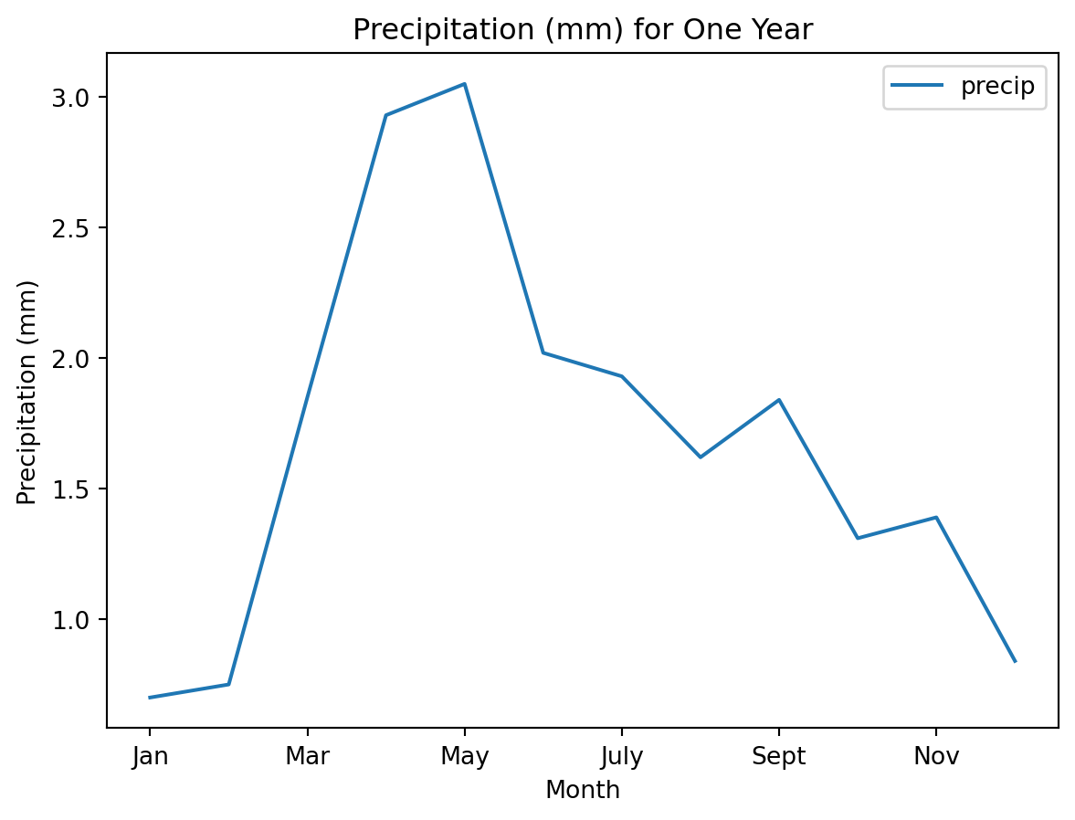
Important
When you are using an interactive notebook, any plot you create in the last line of a cell will be displayed no matter what. However – you may notice that it also displays some extra text unless you add the line plt.show() to the end. This line of code cleans up the display for you a bit.
Show our solution!
avg_monthly_precip.plot(
    # Make it a bar plot
    kind="bar",
    # Change the color of the bars using color=
    color="green",
    x="months",
    y="precip",
    title="Challenge 2 Plot: Precipitation (mm) for One Year",
    xlabel='Month',
    ylabel='Precipitation (mm)')
plt.show()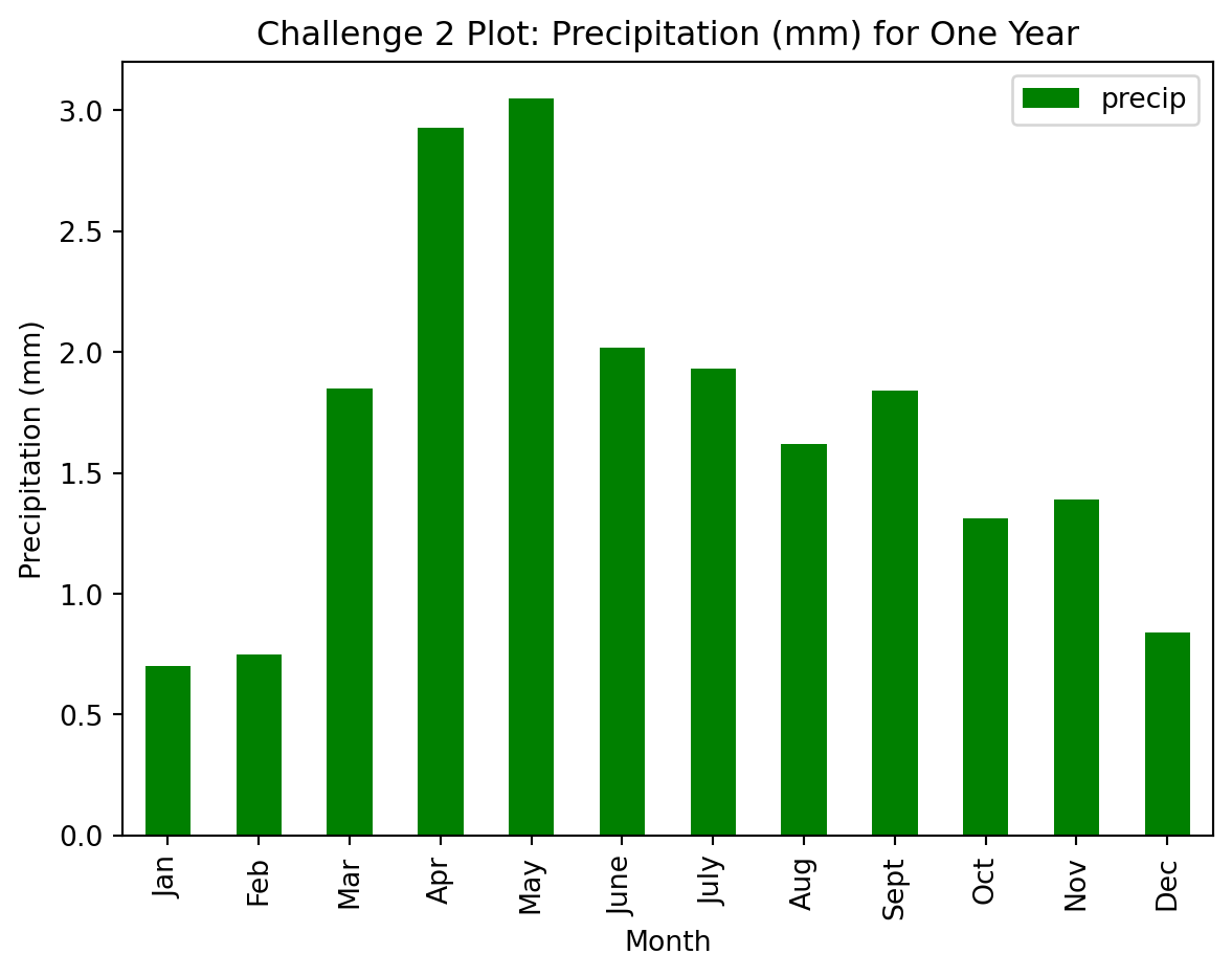
Cleaning Tabular Text Files So You Can Open Them in Python
Missing Data Values & Headers in Text Files
Not all text files are as simple as the example above. Many text files have several lines of header text above the data that provide you with useful information about the data itself. This data is referred to as metadata.
Also, often times, there are data missing from the data that were collected. These missing values will be identified using a specific value that is hopefully documented in the metadata for that file.
Next you will explore some temperature data that need to be cleaned up.
Data Tip
You can visit the NOAA NCDC website to learn more about the data you are using below.
- Miami, Florida CSV: https://www.ncdc.noaa.gov/cag/city/time-series/USW00012839-tmax-12-12-1895-2020.csv
- Seattle, Washington CSV: https://www.ncdc.noaa.gov/cag/city/time-series/USW00013895-tmax-1-5-1895-2020.csv
# Open temperature data for Miami, Florida
miami_temp_url = (
    "https://www.ncdc.noaa.gov/cag/city/time-series"
    "/USW00012839-tmax-12-12-1895-2020.csv")

miami_temp = pd.read_csv(miami_temp_url)
miami_temp| # Miami | Florida January-December Maximum Temperature | |
|---|---|---|
| 0 | # Units: Degrees Fahrenheit | NaN |
| 1 | # Missing: -99 | NaN |
| 2 | Date | Value |
| 3 | 194812 | 82.8 |
| 4 | 194912 | 82.3 |
| ... | ... | ... |
| 71 | 201612 | 84.6 |
| 72 | 201712 | 85.9 |
| 73 | 201812 | 84.5 |
| 74 | 201912 | 85.9 |
| 75 | 202012 | 85.9 |
76 rows × 2 columns
Notice that the data above contain a few extra rows of information. This information however is important for you to understand.
Missing: -99– this is the value that represents the “no data” value. Misisng data might occur if a sensor stops working or a measurement isn’t recorded. You will want to remove any missing data values.Units: Degrees Fahrenheit– it’s always important to first understand the units of the data before you try to interpret what the data are showing!
Below you will use all of the information stored in the header to import your data. You will also remove the first few rows of data because they don’t actually contain any data values. These rows contain metadata.
Function Parameters in Python
A parameter refers to an option that you can specify when running a function in Python. You can adjust the parameters associated with importing your data in the same way that you adjusted the plot type and colors above.
Below you use:
skiprows=: to tell Python to skip the first 3 rows of your datana_values=: to tell Python to reassign any missing data values to “NA”
NA refers to missing data. When you specify a value as NA (NaN or Not a Number in Python), it will not be included in plots or any mathematical operations.
Data Tip
You can learn more about no data values in Pandas in the intermediate earth data science textbook
# Open the Miami data skipping the first 3 rows and setting no data values
miami_temp = pd.read_csv(
    miami_temp_url,
    skiprows=3,
    na_values=-99)

# View the first 5 rows of the data
miami_temp.head()| Date | Value | |
|---|---|---|
| 0 | 194812 | 82.8 |
| 1 | 194912 | 82.3 |
| 2 | 195012 | 81.5 |
| 3 | 195112 | 81.9 |
| 4 | 195212 | 82.5 |
Challenge 3
Now that you have imported temperature data for Miami, plot the data using the code example above!! In your plot code, set Date as your x-axis value and Value column as your y-axis value.
See our solution
miami_temp.plot(
   x="Date",
   y="Value",
   kind="line",
   title="Challenge 3 Plot: Temperature (Fahrenheit) - Miami, FL",
   xlabel='Date',
   ylabel='Temperature (Fahrenheit)')
plt.show()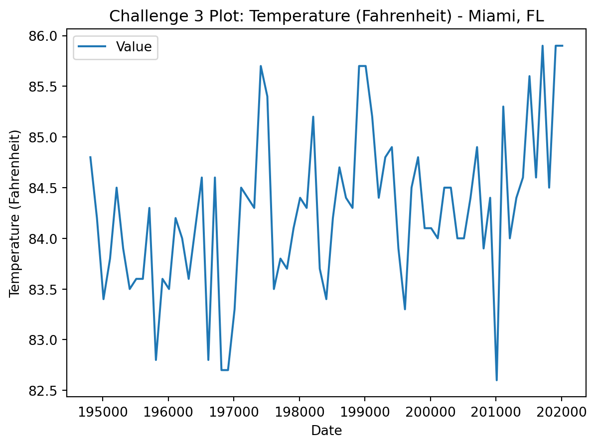
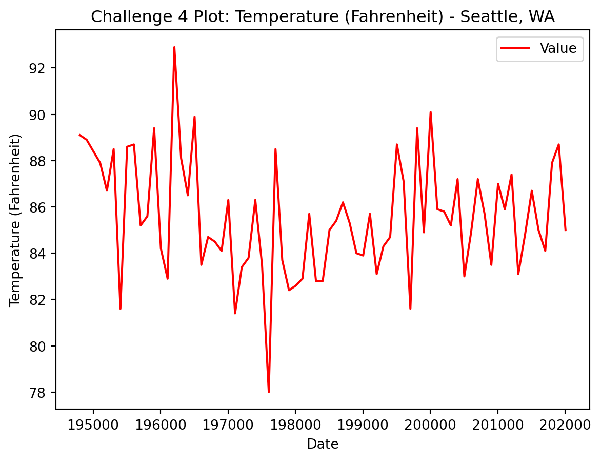
Challenge 4
Use the link below to open and plot temperature data for Seattle, Washington. Don’t forget to take a look at your data before you plot it!
https://www.ncdc.noaa.gov/cag/city/time-series/USW00013895-tmax-1-5-1895-2020.csv
See our solution here!
# Open the Seattle data
seattle_temp_url = (
    "https://www.ncdc.noaa.gov/cag/city/time-series"
    "/USW00013895-tmax-1-5-1895-2020.csv")
seattle_temp = pd.read_csv(
    seattle_temp_url,
    skiprows=3,
    na_values=-99)

seattle_temp.plot(
    x="Date",
    kind="line",
    y="Value",
    title="Challenge 4 Plot: Temperature (Fahrenheit) - Seattle, WA",
    color="red",
    xlabel='Date',
    ylabel='Temperature (Fahrenheit)')
plt.show()